10 things to love about the new Dovetail Agent

There are so many things I love about the newer Dovetail Agent compared to the older versions. Here’s a few of my favorites.
(For reference, when I say “new”, I mean version 5 and higher. As of this writing, the latest version is Agent 10. Although I say “new” Dovetail Agent, it’s really been out since 2013. But it is much newer than our older Agent app (version 4 and below), which is over 10 years old now.)
1. No popups
This is probably one of the biggest complaints we had about the older app – every page was a new popup window.
Start with the console, then open a case, then click on the Site, then click one of the contacts, then click on Log Phone Call. You now have 5 windows open. Ugh.
It’s difficult to manage all those windows. We got it wrong years ago:
Yuck.
Now, each page stays in the original window. But – if you want something in a new window or a new tab – the user has that power.
Shift-click a link, and it opens in a new window. Ctrl-click, and it opens in a new tab. This is expected behavior for web apps.
2. Multi-Browser support
In Dovetail Agent 4, we only supported Internet Explorer.
To be fair, when we first started developing the Agent app, IE was it. It had something like 90% market share, especially within enterprise organizations.
Today, IE is no longer the only real player in town.
As of Dovetail Agent 10, we support
- Internet Explorer
- Google Chrome
- Mozilla Firefox
- Microsoft Edge
3. Performance
The performance difference between Agent 4 and Agent 10 is night and day.
Almost every action in Agent 4 was a new page, and carried with it all of the associated Javascript and CSS. There was very little AJAX in the app. Very little caching. No optimization of static content.
Agent 10 is a SPA (single page app), which means new pages are just the page content and template – which means fewer requests and less data being transferred. We do server side optimization of static content (such as the Javascript). And it’s architected so that the client can cache more information.
In addition, we’ve added paging in many places throughout the app. For example, when looking at the contacts for a site, we serve up 12 contacts at a time, and allow the user to page through the results, rather than sending down hundreds (or even thousands) of contacts.
As a user, the application just feels quick.
4. Case / subcase history enhancements
As a user of the application, I spend a lot of time reading the history of cases and subcases. This is such an important part of the system – reading and understanding customer issues/questions.
We’ve given a lot more prominence to the history now.
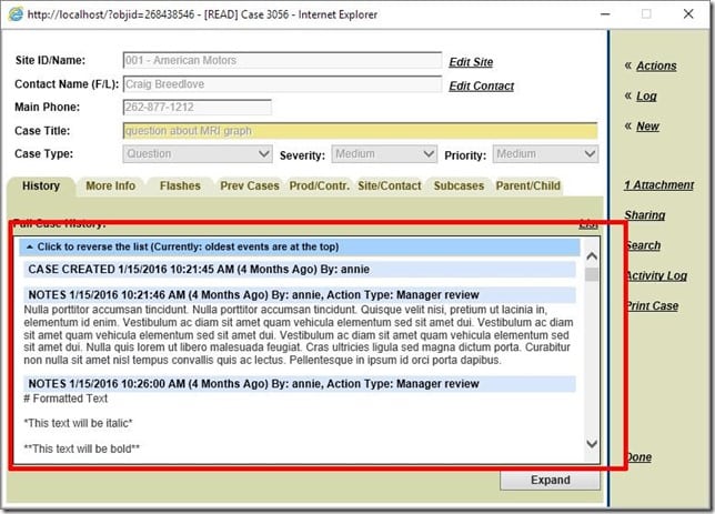
Before, the history was contained within a small area:
For reference, that history area is about 650 x 500 pixels. regardless of monitor size. So even on my 1920×1080 monitor, that case history is small.
Yes, there was an Expand button, but even that wasn’t great.
To contrast that, Agent 10 gives the history the prominence it deserves:
That case page can take up all of my monitor, if I want it to.
That history is now larger and *much* easier to read. In addition, it includes:
- Avatars for users (which default to their initials, if one isn’t set)
- The new history combines the case_history and the activity log. So we were able to get rid of the separate activity log, thus simplifying the app, while still providing all the information that the user needs.
- Toggle for showing and hiding less important activities (such as business rule actions). Plus, this setting is automatically remembered for each user.
- History is reversible – either chronological or reverse chronological. Again, this setting is automatically remembered for each user.
- Inline Images (shown as thumbnails, and then click to view full size)
- Include Email Header Information
- Show Original Email Messages in a collapsed state
- Auto-updating timestamps
- Auto-updating history content
All in all, it adds up to a much more pleasant and easier-to-use experience.
Read more:
5. Rich text formatting / markdown
Dovetail Agent supports markdown throughout the app, including rich text, images, and embedded videos – *so* much nicer than just plain text.
For example, outgoing emails sent to customers:
and solutions:
Read more:
6. Tags
We’ve replaces Wipbins with Tags.
With WIPbins, an object (such as a case or solution) can only belong to one WIPbin. But with tags, a case can have as many tags as we want.
For example, I may have a WIPbin named “Important”, and a WIPbin named “Waiting on Customer”. But what if I have a case that is important, and it’s waiting on a customer reply? That case can only be in one of those WIPbins at any one time. With tags, I can add two tags to the case: important and waiting-on-customer.
This gives me much more flexibility in how I organize my work.
Tags on the console:
Tags for a case:
And users can even tag items that they don’t own – which makes it easy to track items in the system.
Read more about tagging within Dovetail Agent
7. Keyboard Shortcuts
Throughout the app, keyboard shortcuts increase user efficiency. There are shortcuts for navigating through the app (Go Home, Go to Recent Items, Search, etc.), as well as for invoking actions on entities (Edit, Log Email, Log Notes, Dispatch, Assign, etc. ). And the “?” keyboard shortcut shows the user all of the available shortcuts:
8. Broadcasts
A broadcast is used to communicate a message to all users.
Broadcasts appear in the user’s notification drawer – along with Notifier messages (such as from business rules).
A few examples of usages for broadcasts
- The system will be going down tonight at 5:00 PM for maintenance.
- If a customer calls about the special holiday promotion, here’s what you need to know.
- This app has been updated to a new version – here’s what’s new/changed
- Application tips
- Outgoing shipments will be delayed because of the snow storm.
- Or whatever other message you want to send to your users.
Read more about broadcasts:
9. User Configurable console
On the console (home) page, user’s have a bunch of options for tweaking this page for their individual preference
- Users can configure their console by:
- Showing/hiding columns
- Reordering columns
- Resizing columns
- The user’s console configuration is automatically saved
- Preview Pane
- Users can now resize the width of the preview pane
- The user’s preview pane width is automatically savedThe left sidebar (Navigation Menu) can be hidden, and the page content will expand to fill the entire page. The app will automatically remember the menu’s hidden/displayed state, so if you want it hidden, it’ll stay hidden (until you explicitly display it again).
- Clicking a column header now has a tri-state: sort ascending, sort descending, no sorting. In addition, multiple column sorting is available using shift-click on a column header to sort by additional columns.
And the console also includes
- Paging – The number of items shown in the grid will be dynamically adjusted based on the height of the browser window.
- Batch Actions – for performing workflow actions or logs on a number of items at one time
- Separation of each entity (case, subcase, solution, part request) into its own tab – eliminating the intermingling of items and the resulting sparse grids.
10. Search
The search box is always present at the top of the page – making it easy to find whatever you’re looking for – cases, solutions, contacts, sites, employees, contracts, etc.
Just type in what you’re looking for – and let the system do the hard work.
This worked in Agent 4:
But with the new Agent, we’ve added more context to each search result:
Notice:
- The site result includes the site id and address information
- The case result includes the contact and site information, last update date, and its condition (Open or Closed)
- The contact result includes the contact phone number and primary contact role
- The contract result includes the contract type, start and end dates, and its state (Open/Closed)
In addition, we use the search functionality in many places throughout the app, such as:
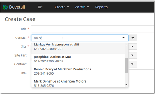
finding a contact when creating a new case:
when picking a queue:
when selecting an employee:
when searching for tasks:
Summary
It was actually tough limiting this list to just 10. There’s a lot to love about the new Dovetail Agent. Maybe my next post will be items 11-20.
Moving from the Clarify Classic Client to the original Dovetail Agent was pretty awesome – it was great to get rid of the old client-server app and move to the web.
I think the new Dovetail Agent app is even more awesomer. (Spell-check is telling me “awesomer” isn’t a word – pffft!)
If you haven’t experienced the new Dovetail Agent – just reach out to me. I’m happy to walk you through it, discuss in more detail, or even give you access to our sandbox environment.
Rock on.
Postlude – A Visually Impactful Image
I was told that the images I use in my posts are not visually impactful. Well, dang.
I’ve been more concerned about educating than entertaining.
So, here you go. A visually impactful image. I hope.


